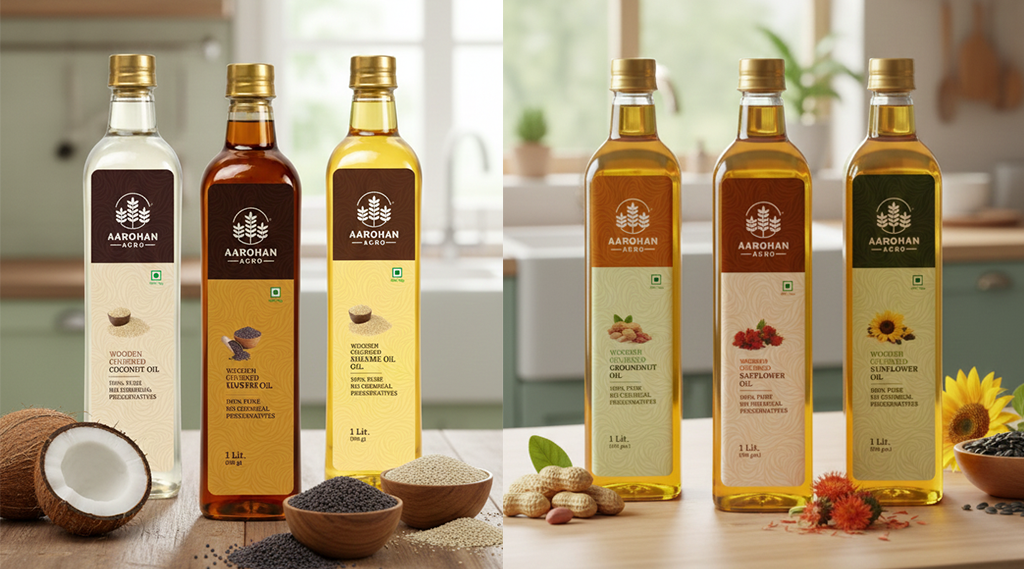
Aarohan Agro, a brand rooted in traditional wooden cold-pressed oil production, was looking to evolve its identity without completely changing its existing logo. We connected through a business club platform, where the idea of rebranding Aarohan Agro was first discussed. The original logo had a strong approach, which we chose to respect and retain. Our focus was on correcting technical gaps and refining visual balance, color palette, and typography.
These thoughtful enhancements brought renewed clarity and freshness to the logo. The updated identity feels more professional while staying true to the brand’s heritage. We extended the same design discipline to the oil bottle packaging. This created a consistent and confident brand presence across products.
The refreshed branding boosted the client’s confidence in their offerings. The result was clear market impact and visible growth in overall sales, which remains the true goal of effective branding.