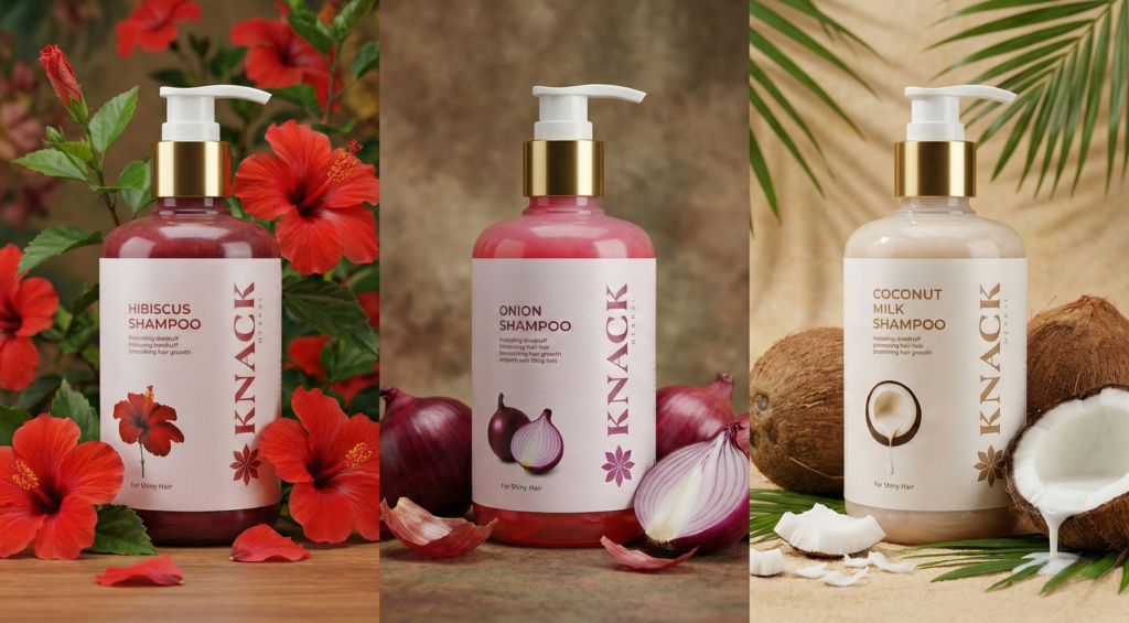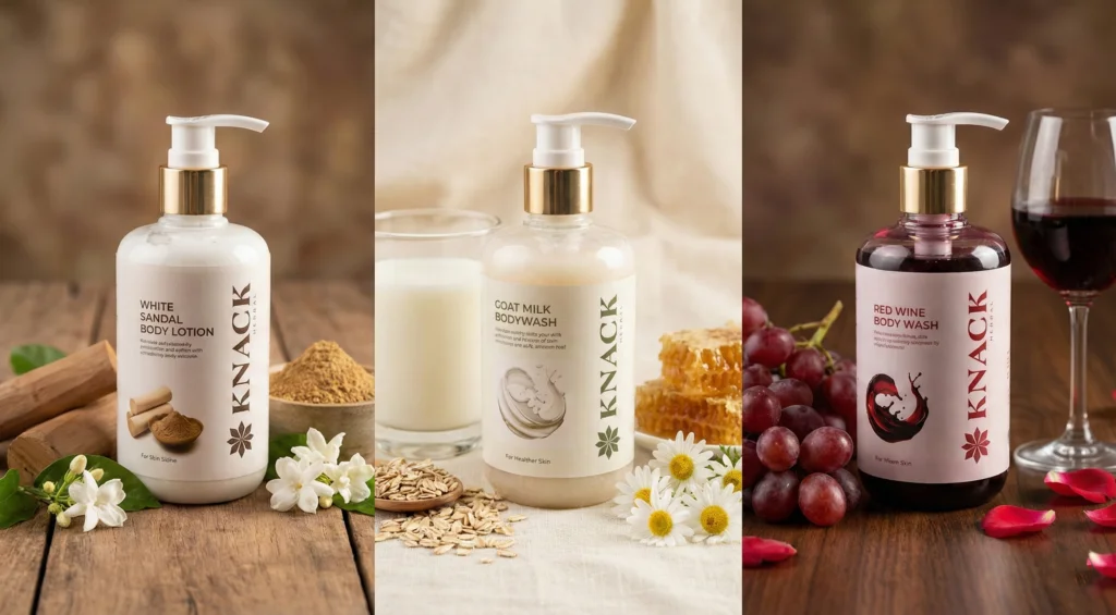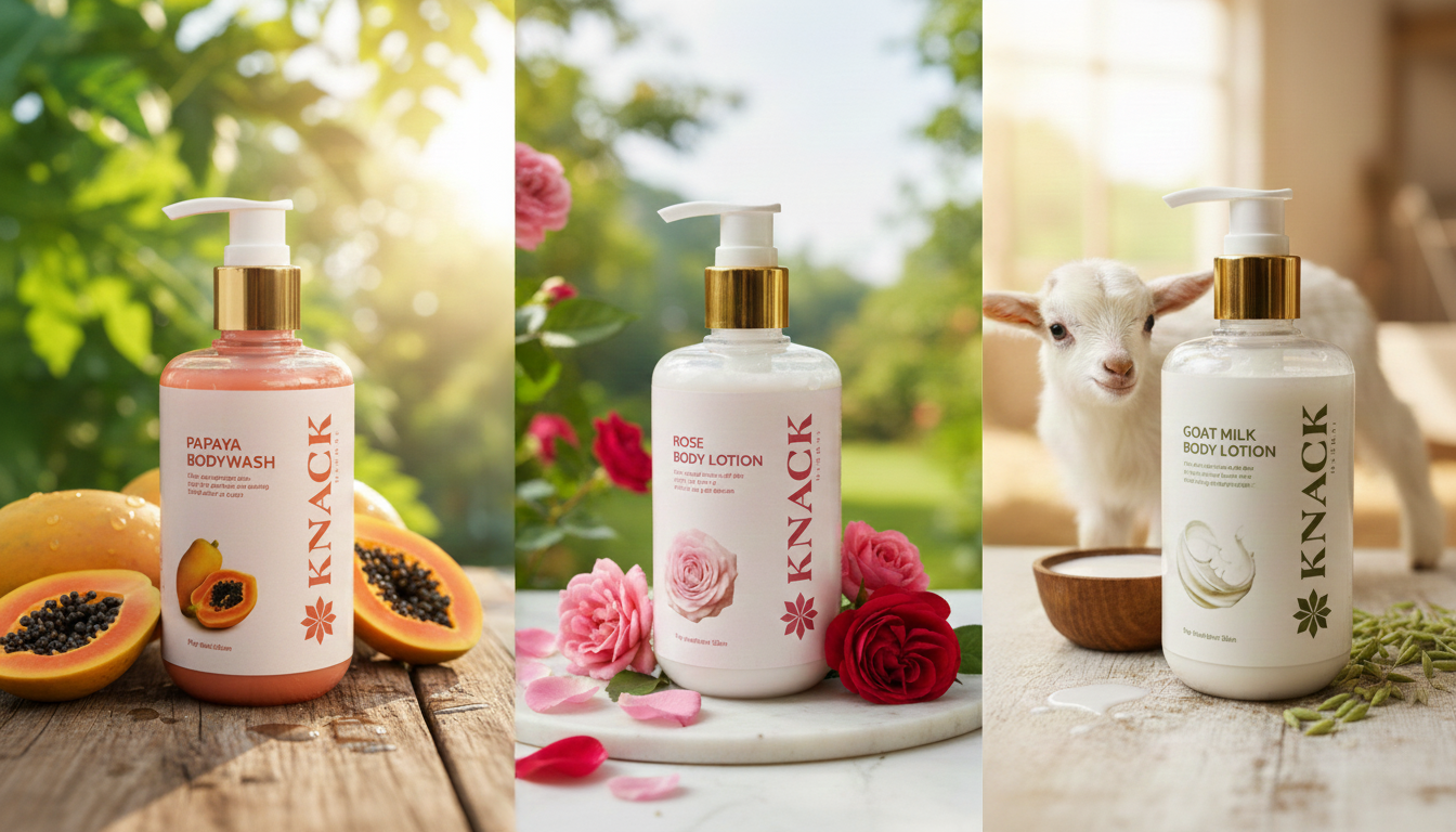
Knack Herbal approached us with a clear vision: to translate the precision and refined aesthetics of their interior design and architecture practice into a new herbal cosmetic brand. Our challenge was to create a brand that feels beautiful, effective, and trustworthy from the very first glance.
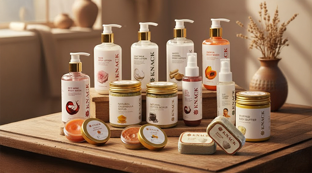
We began by crafting a distinctive logo built around the letter “K”, symbolizing accuracy, balance, and visible results. The identity was designed to reflect purity, confidence, and modern herbal care. We extended this philosophy into a clean, minimal packaging system that highlights the product range without visual noise. Every detail was considered to ensure clarity and consistency across touchpoints. Despite being a new entrant, the brand quickly established credibility in the market. The design language helped Knack Herbal stand out while staying true to its natural roots.
This project is a strong example of how thoughtful branding accelerates trust.